Interpreting Benjamin Moore’s 2020 Colour of the Year, 2102-70 First Light, for a Winter Climate

I’m not usually a fan of pale pink, so I can’t say I fell madly in love with First Light when it was announced. The pink I prefer is a bit darker and leans a bit more toward coral.

That said, how pretty is this pillow?!

I truly believe there are no bad colours — only better or worse uses of them — so I decided to play around with First Light a bit to see how I would incorporate it into three different rooms.

As an added challenge, I wanted to do it in a way that felt grown-up and geographically appropriate for the Canadian prairies.

Pale Pink Backdrop to an MCM-inspired Living Room

To my eye, pale pink is most liveable when combined with stronger, earthier colours, and I think this first room illustrates how delish that combination can be.

pale pink walls in living room
Pale pink walls in a boho-inspired living room.

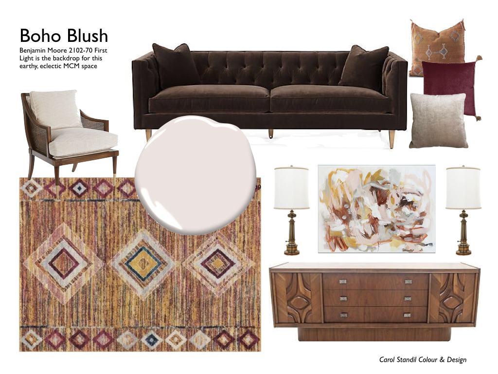
The abstract artwork over the credenza was my starting point for this living room.

From there, I layered in the tribal rug that seemed made to order to go with it and firmly set the mid-century vibe. I love how the detail in the doors of the vintage credenza echoes the diamond shapes in the rug.

I’ve always adored a dark, chocolate brown velvet sofa, and I can see this one standing out beautifully against the soft pink walls. A deep burgundy would work, too. Fresh enough for a Manitoba summer; cozy enough for winter. YES!

A Pale Pink Bedroom for Grown-ups Only

I was working on a very different bedroom concept until I saw this tobacco brown velvet headboard.

To be clear, this is not the thuddingly depressing and overused hue of the brown trend that many of us are just now crawling out from under. This is a gloriously rich, vibrant colour that transcends a trend. Just sayin’.

Example of pale pink walls in a bedroom with tobacco brown accents
I am a sucker for pale pink with leopard print. Well, almost anything with leopard print, frankly.

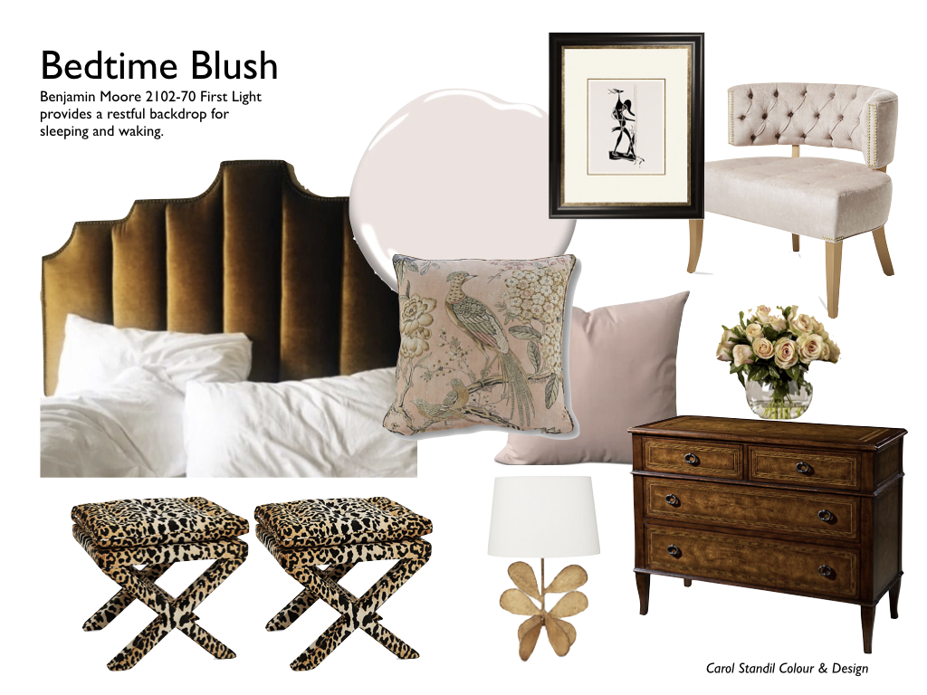
In this bedroom, rich tobacco brown (NOT Espresso) and sexy leopard print stools at the foot of the bed help cut the sweetness of pale pink walls and accents.

I think this room also nicely straddles the line between feeling not too heavy in summer and not too light in winter.

In my opinion this is pink at its grown-up, grounded finest.

Are Pink and Blue For Babies’ Rooms Only?

I wasn’t convinced I could stomach First Light with the other colours in the 2020 palette. Until my first design board for this dining room fell utterly flat. See for yourself.

First take. Meh. Makes me blush to share it.

I tend to reject pale pink with blue or soft green as too reminiscent of the eighties or a baby’s nursery, but I decided to try to prove myself wrong by using some of the other colours from Benjamin Moore’s 2020 colour palette to rescue this room.

First, I looked at artwork with the goal of finding something that included blues, greens and pinks without feeling babyish.

This painting of rocks and water I found on One King’s Lane was, to my eye, the perfect choice — not too pastel, and literally grounded with earthy tones in the rocks.

Left to right — some of the colours from the 2020 COTY palette that inspired the second take on this dining room: HC-149 Buxton Blue, 2128-40 Oxford Gray and AF-485 Crystalline.

Happily, I think I did it.

I found a way to work with the colours in the palette that feels timeless and liveable and satisfies my eye’s need for something to ground the pink.

What do you think?

Example of pale pink walls in a dining room with blue accents
Dark wood keeps a pale pink and blue dining room from becoming too sweet.

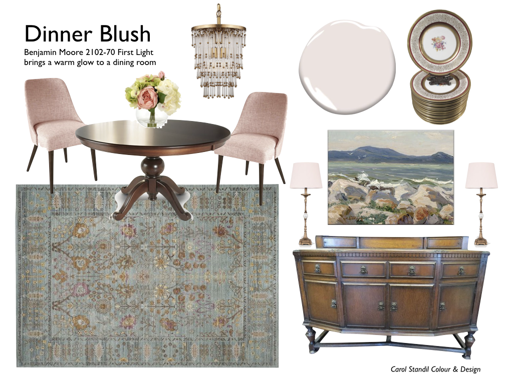
Things started to shift as soon as I added the new picture above the buffet, but the room truly sprang to life when I added the blue and pink rug. (See how the pink chairs went from meh to marvellous?) And I love how the warm wood furniture adds a rich, grounding element.

So, here’s my take on Benjamin Moore’s Colour of the Year for 2020

I don’t know that my clients are going to rush to paint their walls pink, but I think there are ways to work with First Light and the other colours in this palette that feel grown-up and very liveable.

As always, you have to adapt a colour palette to make it suit your environment. If I lived in California, I might have taken a totally different approach, but with Manitoba’s winters in mind (and perhaps influenced by an unseasonably early snowstorm), I focused here on using these fresh colours in a way that would feel equally appealing in winter as in summer.

If you need help bringing YOUR colour palette to life — or finding your palette, I can help.

Green get started button

Are You Getting Enough Greens (In Your Decor)?

Spinach, Celery, Olive, Avocado, Lime…

I think it is no small coincidence that green is the colour of some of our most nutritious foods. Just as we need lots of these nutritional powerhouses in our diets, adding a healthy serving of greens to your home’s interior can help boost your well-being when the days are short and cold and the landscape is gray and bleak.

This winter, I am on a campaign to encourage you to banish the winter blahs by adding more good colour to your environment.

We Found: Seven Easy Ways To Add Green To Your Home

The colour of new growth, green is optimistic and life-affirming.

And there is a reason why we never tire of looking at a green landscape: Green is easy on the eyes. In her book All About Colour, Janice Lindsay says “…our eyes can relax when they look at green because the wavelength is the perfect length to fit our eyeball. It lands smack on the retina without any focusing effort or adjustment.”

These irises are one of the first signs of life in my garden each spring. Photo: Carol Standil

These irises are one of the first things to start showing life in my yard each spring, and a welcome sight indeed! Photo: Carol Standil

Green might be nature’s perfect neutral. All greens work well together and pretty much every colour looks good against greens. How perfect is that little touch of purple in the iris buds above?

If a soft and subdued palette speaks to you, nature is ready to show you how to achieve it. Take inspiration from a favourite vacation spot or your own back yard.

Fresh green, blue green, soft sage green — all blend beautifully in nature. Image source: Pinterest

Soothing Green Room

Don’t you think this living room could have taken its inspiration from the luscious succulents above?

Mixed greens create a soft, pretty and serene living room. Image source: Pinterest

Nature can also inspire a lively and energetic colour scheme for your room. Consider your favourite summer flowers (I happen to love zinnias)…

Take inspiration from a sunny bed of zinnias. Green leaves make a stunning backdrop for the colourful flowers. Image source: Pinterest

…and translate them into a vibrant and cheerful room like this.

Vibrant Green Living Room

Enjoy summer all year when you decorate with colours pulled straight from the flower bed. Image source: Pinterest

Want to join me in my campaign to beat the winter blahs with colour?

Like my Facebook page to see a new inspirational photo each day. Join the conversation by liking, commenting and sharing posts, and by chiming in to tell us how you are adding colour to your world this winter. Use the hashtags #goodcolour, #winterneedscolour and #cravecolour.

I will also post here once a week or so — subscribe to my blog (if you haven’t already) so you don’t miss out.

Enter your email address to subscribe to this blog and receive notifications of new posts by email.

Are you ready to bring more of green’s life-affirming properties into your home?
I can help you turn your inspiration into reality.

Green get started button

The Colour Secret To Boost Creativity

If your work demands creative thinking, (and whose doesn’t?!), decorate your office with blue

Image of office with blue accents

That blue wall could help with creative thinking. Of course, the blue cushion on the window seat wouldn’t do any harm either! Source: Pinterest

Good colours are more than decoration; they are functional. They can actually support us in living our best lives.

A recent article in the Huffington Post shares how blue can help you be more creative. This makes it a great colour for offices or other spaces where you need to innovate or solve problems.

“There’s a reason we love gazing up at the sky and out at the sea so much — the pretty blue hues put us in a relaxed mood and help our minds wander to the most creative of places. A University of British Columbia study found that while the color red helps develop sharper memories, the color blue helps unlock your imagination.” (14 Ways to Bust Out of a Creativity Rut, Alena Hall in  06/05/2014)

Here are three ways to bring blue’s creativity-boosting power to your work space.

1. Paint the walls.

Blue paint for work spaces

Some beautiful blue paint colours.

How to choose blue paint

Many people have trouble choosing blue paint. Blues that look pretty on a small swatch can feel juvenile when blown up on a whole wall, and very pale, clean blue walls can feel cold and insipid. (Although pale grayed blue can be wonderful to make a ceiling seem taller.)

Blue generally gets warmer as it gets darker, but context is critical when it comes to finding just the right one for your space.

For great wall colours, look to more complex blues — blue grays, blue greens, or blue/gray/green blends are generally work well.

TIP: You can often find great blue paint colours by looking at
the gray section of a fan deck.

2. Integrate blue through artwork.

Draw inspiration from sky and water even in a windowless urban office. Source: Pinterest

Blue looks great with pretty much any colour scheme, so adding a great piece of artwork or two can be a great way to bring blue into your existing space.

A beautiful landscape painting or photograph has the added advantage of providing you with an instant get-away. Lose yourself in the scene and let the creative ideas percolate.

If you like your artwork less representational, that’s great too — the important thing is that you choose something that resonates with you.

3. Add colourful furniture.

Inject a large dose of a favourite bold blue with a painted credenza or bookshelf.

The current trend for painted furniture gives you a great way to add a big hit of strong colour to your office without touching the walls.

If you can’t find exactly what you want, you can create your own. Add zing to bookshelves or a vintage credenza with a couple of coats of chalk paint in your favourite shade of blue. Now you’ve got something that is both lovely to look at and packed with practical storage for office supplies and important files.

Colour is Context

As with all colour, blue will be affected by its environment. A gray blue that feels cold and unappealing in a north-facing room may be perfect in south light.

The colour of your floors, trim and other furnishings will also play a role in determining which blue will look and feel right. Adding a cool blue item to a room with warm wood tones and yellow-beige walls will have a very different effect than would adding the same item to a room with cool gray walls and flooring.

If you’d like help choosing and co-ordinating the perfect colours for your space, contact us to book a Colour and Decor Consultation.